Brush of Honor Media Kit


Sales At A Glance (AAG)
Web Banners Design


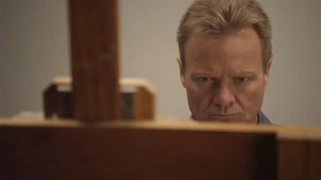
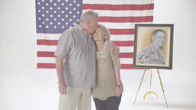
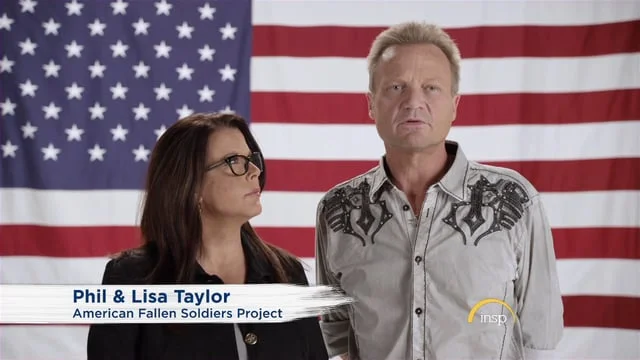
Phil Taylor is an artist living in the Dallas Fort Worth area. When a friend of his died in Iraq he decided to honor his memory by painting a portrait and presenting it to the family. Phil was so moved by their reaction that he began painting portraits for more soldiers and eventually started a non-profit organization. INSP bought the rights to the story and made a reality television show called Brush of Honor. The creative team played a key role in producing the logo and key art which was used to develop all marketing and sales collateral materials and web banners. We also produced the show open and EPK both of which were completed in a two day shoot in Dallas with cooperation of Phil and his wife Lisa.
IMDB SYNOPSIS: Phil Taylor paints portraits of fallen American service members and presents them to their families in emotional ceremonies.
TARGET AUDIENCE: W35-49, W50-64, M50-64
RELEASE DATE: May 21, 2015 (10 Episodes)
THE IDENTITY: The logo is a marriage between two distinctly different type faces. The word "Brush" is set in a custom script representing the artistic freedom of the painter, and the word "Honor" set in Trajan, represents structure and gives a sense of reverence. We used red and blue to emphasis the patriotic theme of the show. The tagline, "A Hero's Journey Home" was derived from a comment made by the father of one of the soldiers he said, "I feel like Blake is home again". This was a common theme among the families so it made sense to use this phrase adding the word "Hero" which represents any one of the service men and women who are being honored. It's a intriguing phrase for the viewer as well, as they are promised an opportunity to experience the journey first hand by following Phil as he works complete the painting and present it to the family. Because Phil is new to television and unknown to the viewer we included his photo standing next to an easel wherever it was appropriate in order to build familiarity.
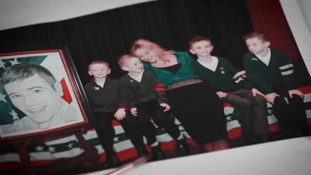
MEDIA KIT: The completed media kit consists of a pocket folder (8.5" x 5.75" finished). We designed seven (8" x 5") photo cards that fits nicely in the pocket. As one looks through the cards they are treated to a short description of the show along with a touching photograph of the family interacting with the painting. The final card has a DVD attached with a custom label and is used to carry video elements such as the EPK. The design incorporates heavy paper stock with a texture similar to the feel of canvas. The canvas look is also used in the broadcast & digital design but brought some challenges. Canvas is a texture and translating the the tactile experience was difficult requiring a great deal of tweaking until we got it right.
Below are samples of the video content including the EPK, promos and the show open.